Nagoya Zokei University Review
Words and photos by Gerald Jason Cruz.
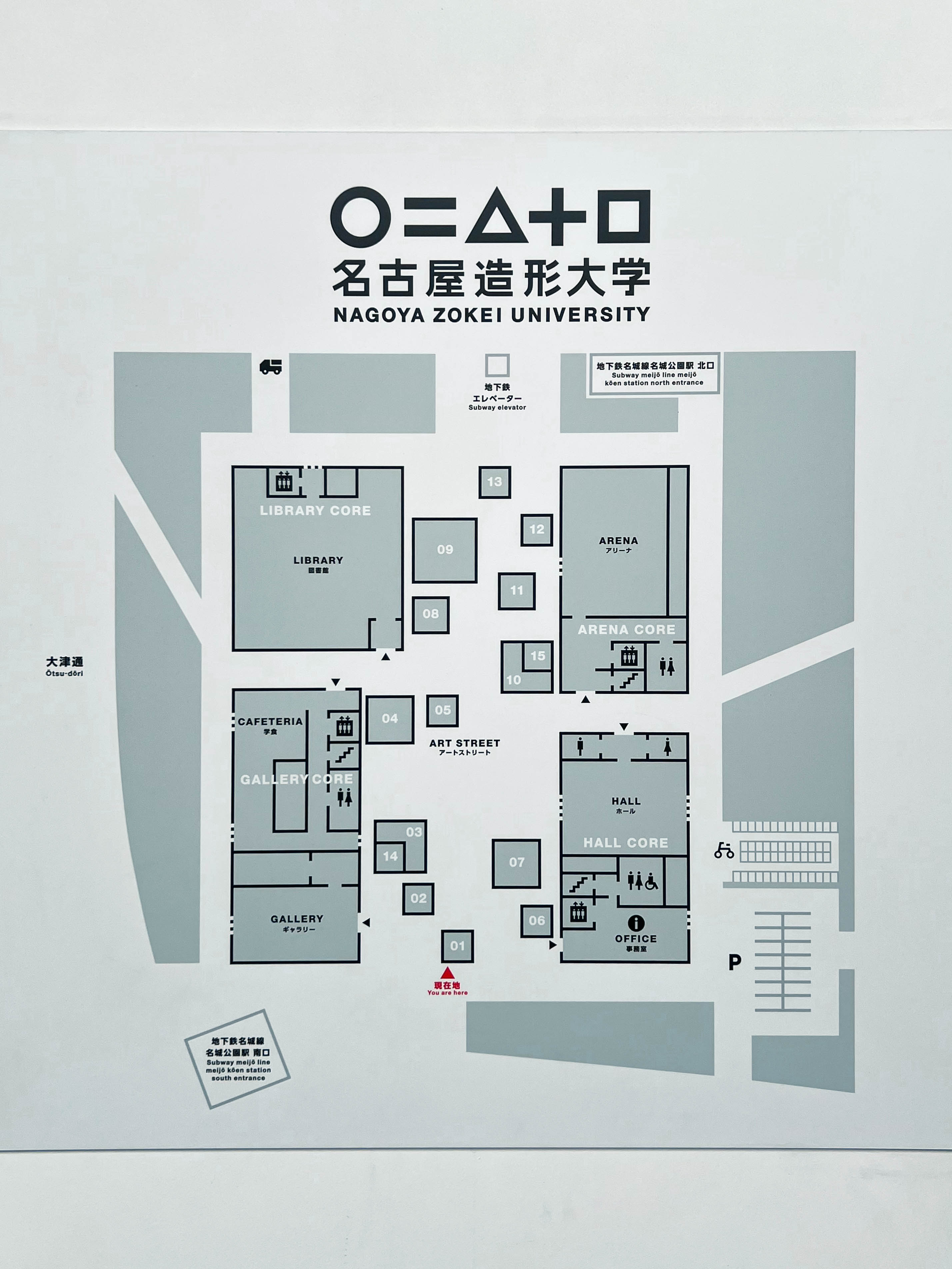
The journey to Nagoya Zokei University starts underground. I found myself at the Meijokoen Station of the Nagoya Metro, located just one stop away from the Nagoya Castle. Currently still undergoing renovations, the subway station below gives no hints as to the institution sitting directly above it. I made my way past plaster construction walls and uncovered ceilings to the south exit of the station.
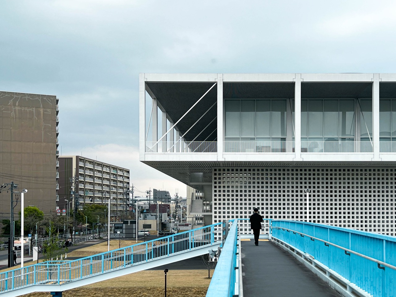
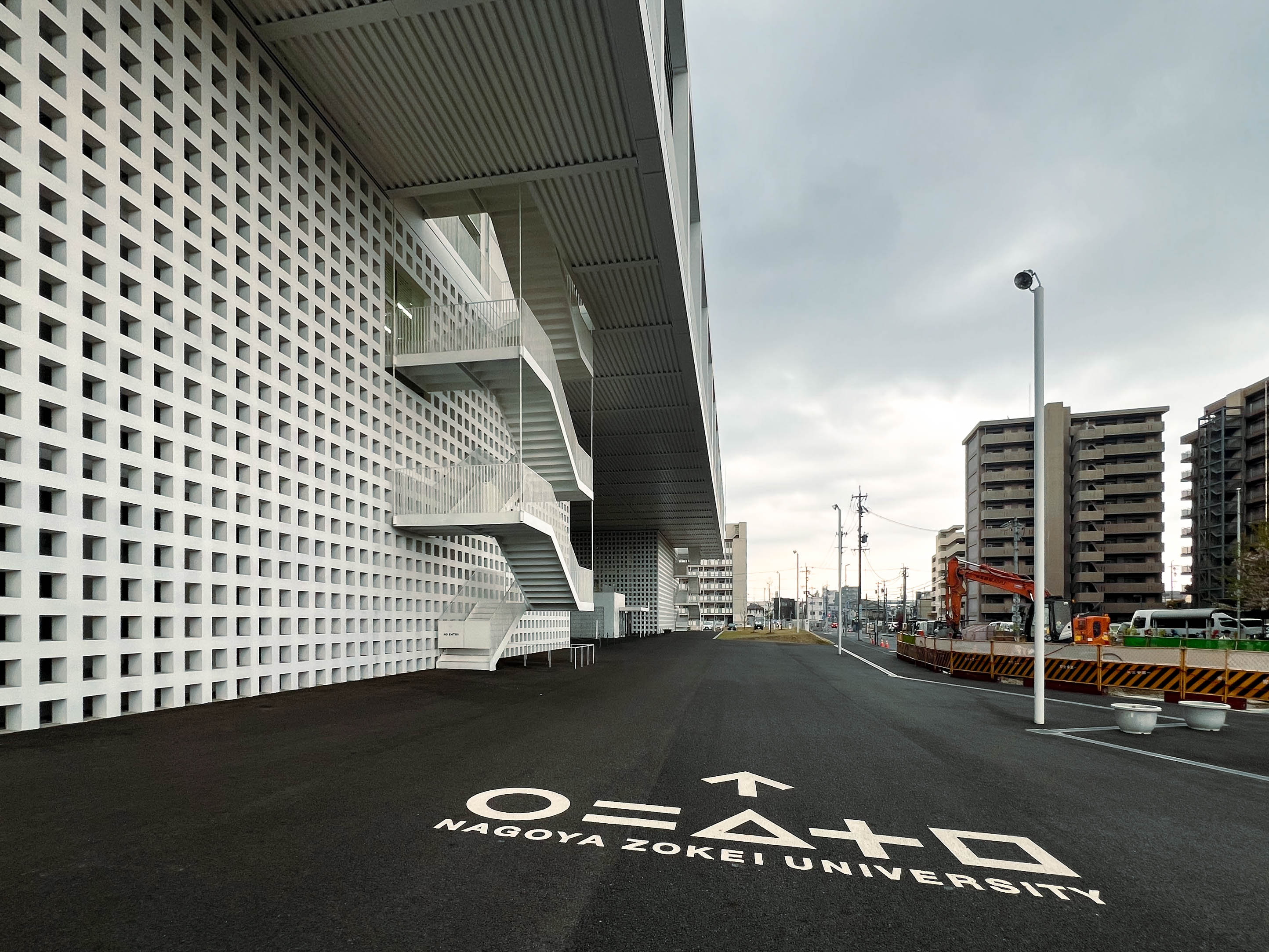
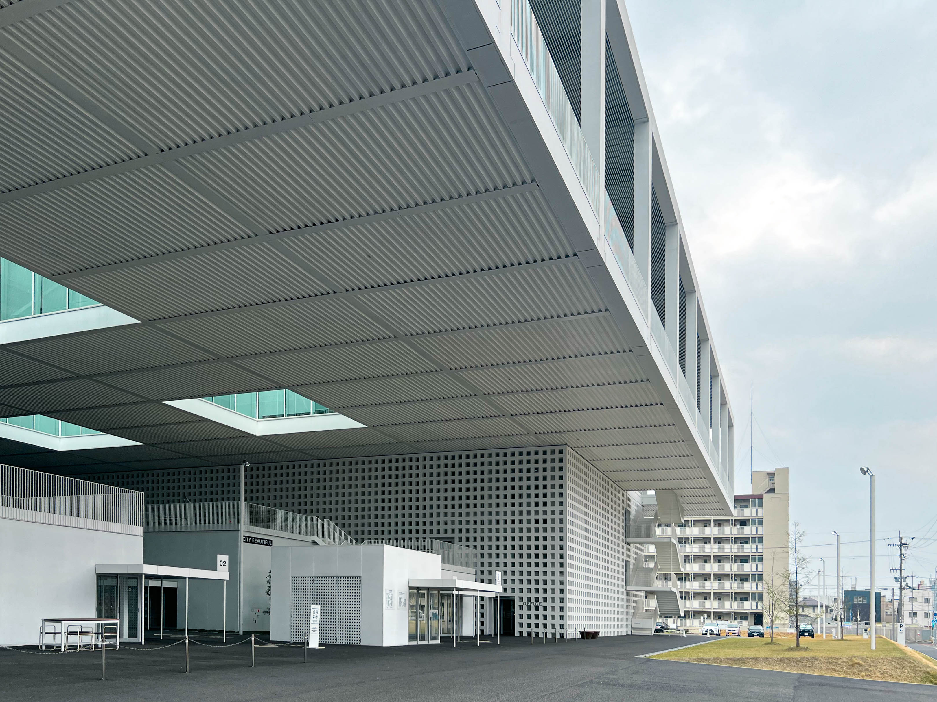
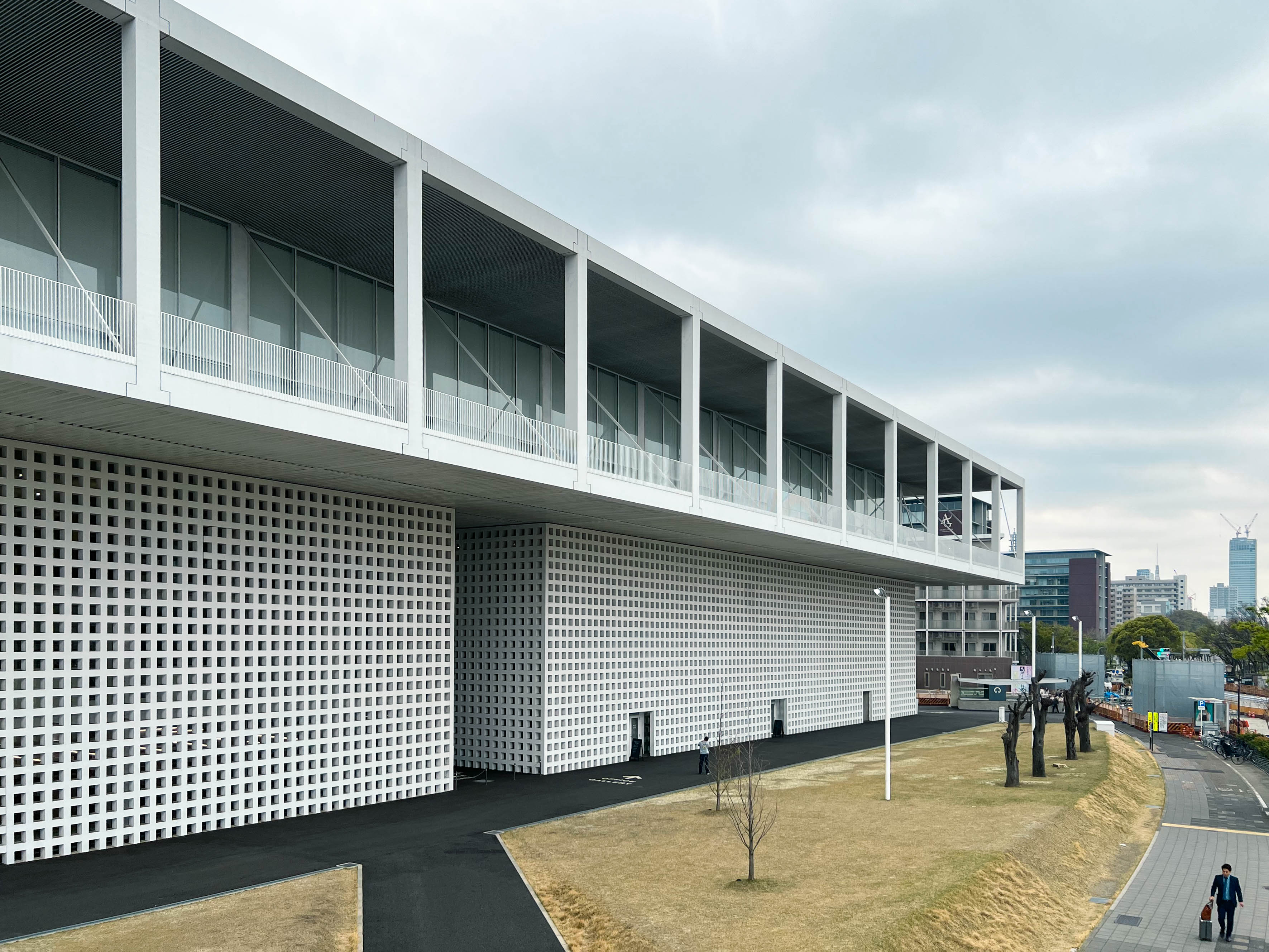
Riken Yamamoto, who received the Pritzker Architectural Prize in 2024, is best known for his philosophy on spaces that blend the public and private. This new university campus is his most recent completed work, and thus I think represents the most up-to-date application of his architectural practice. Nagoya Zokei, which specializes in arts and design majors, relocated from Komaki City in the north of Nagoya to its current location in 2021. It was once the site of a public housing complex, and several apartment buildings can still be seen scattered around the site, thus placing it in an urban fabric that demands sensitivity from its surroundings. The very nature of the building’s site embodies Yamamoto’s philosophy– being located on top of a subway station demands a coexistence with the public sphere. Hence the building gives way to the station beneath it by being divided into four different “cores” that serve as structural columns to the building’s upper floors. The subway exits on both the north and south end face you opposite the campus initially, as if directing the unassuming public away if one doesn’t intend on visiting the campus.
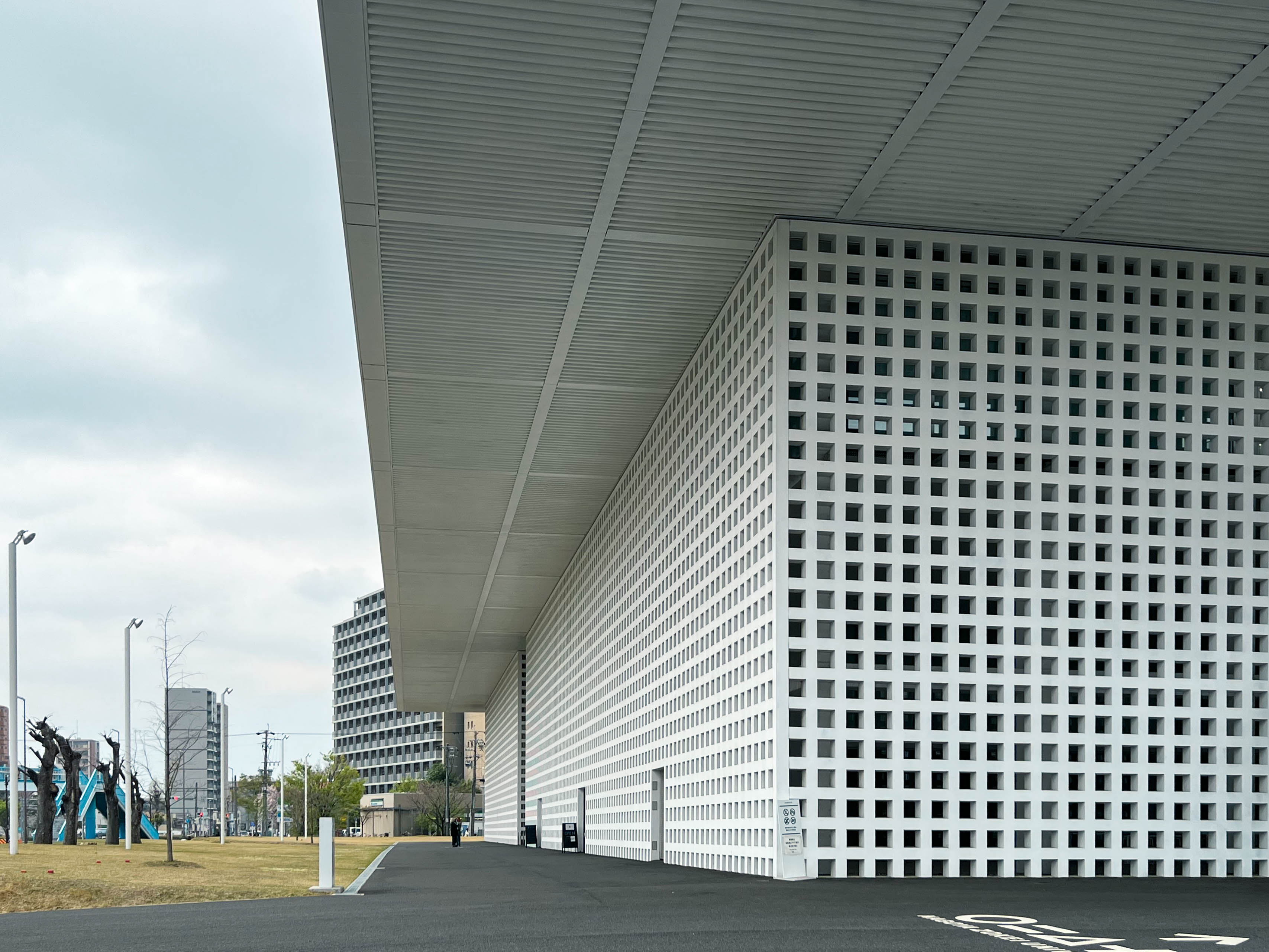
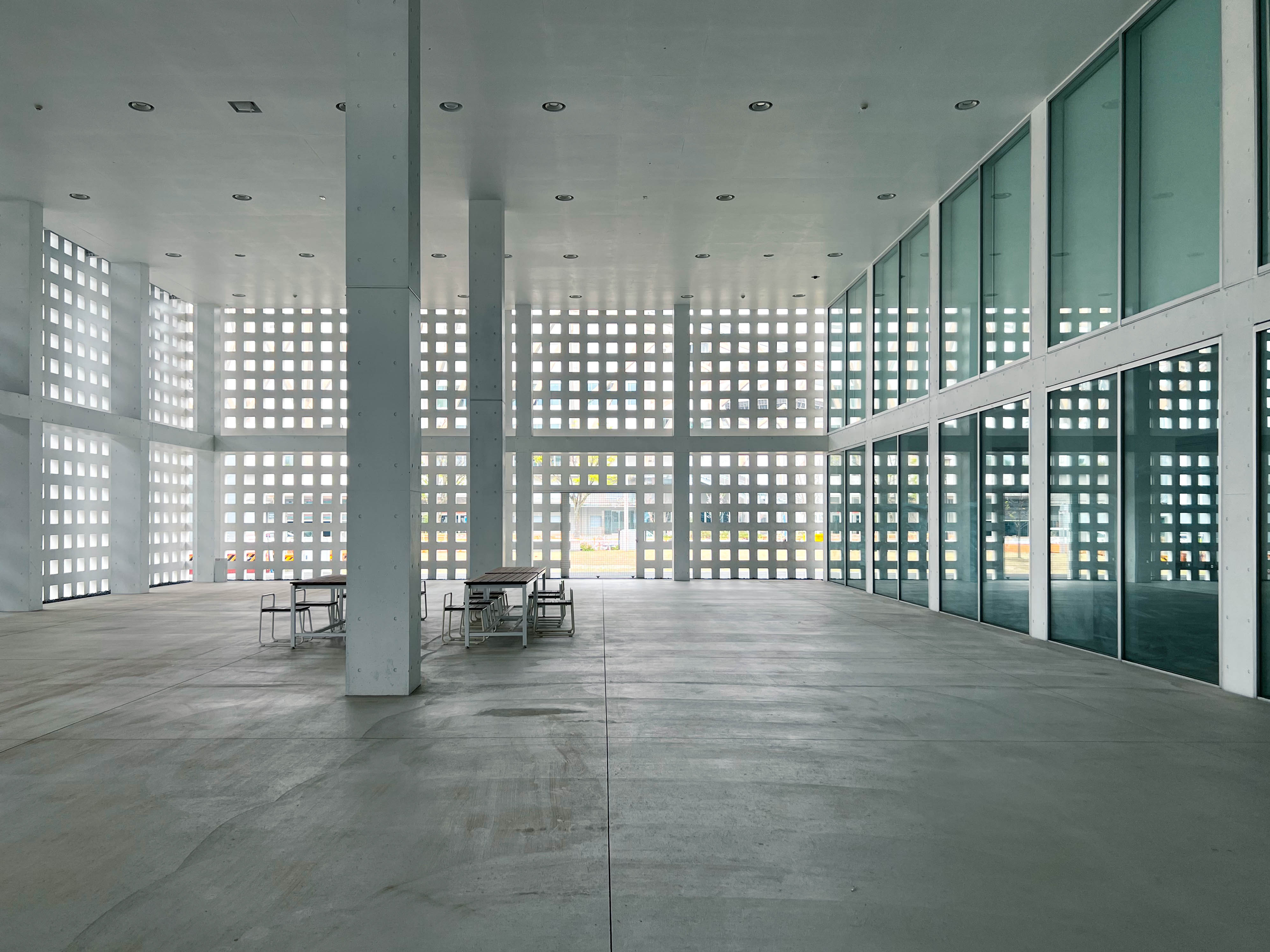
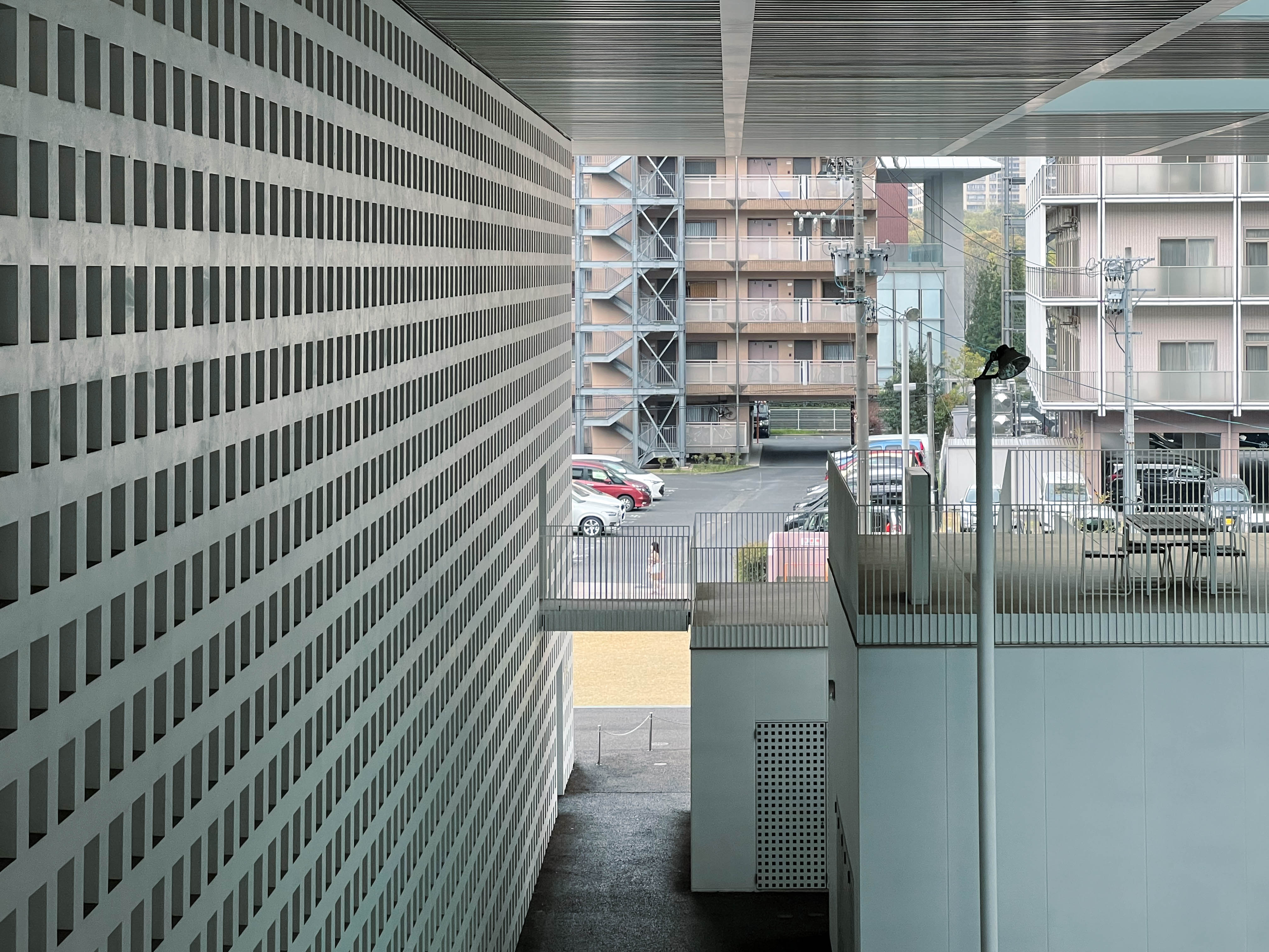
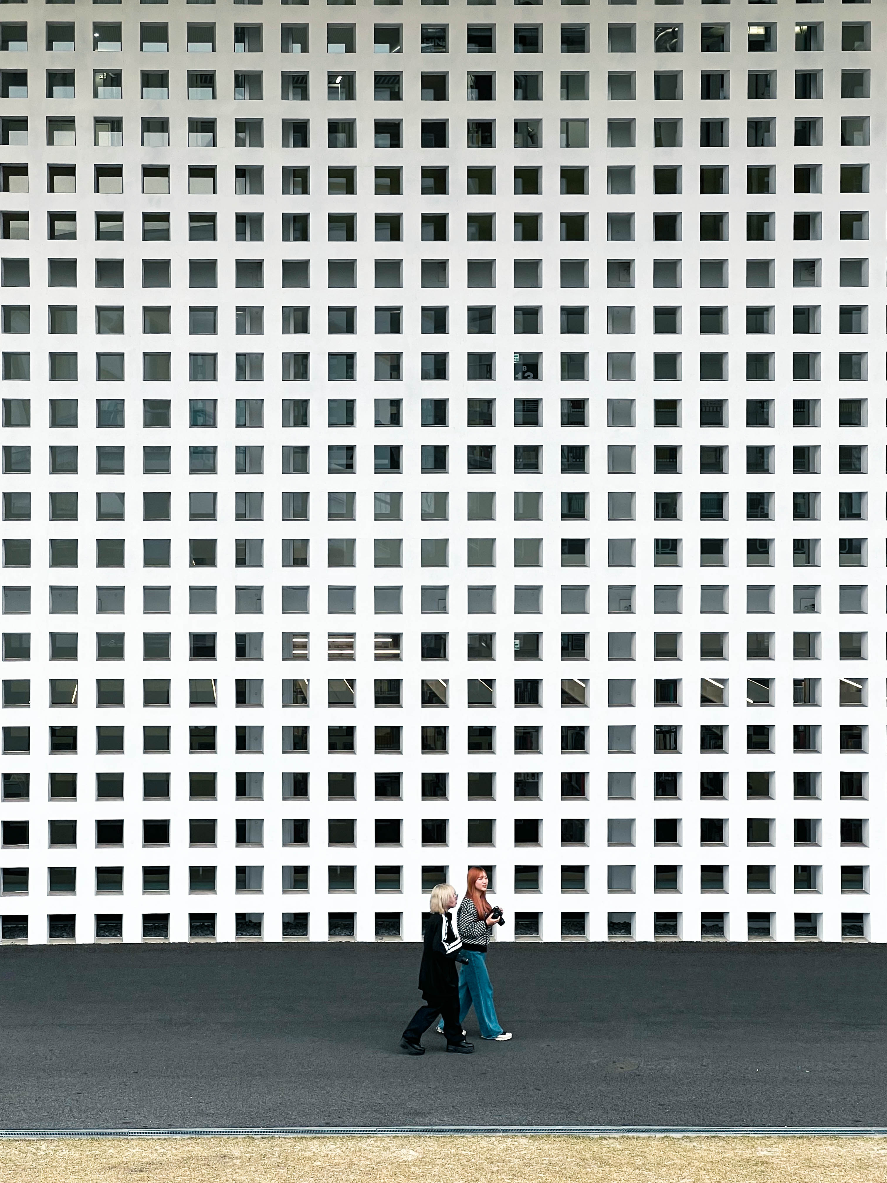
Upon turning around to face the university, I was greeted not by a series of different cores but by a seemingly uniform and imposing structure. Approaching the southwest corner I could see the campus building extending what seemed to be around a hundred meters in both directions. In its essence the architecture of Nagoya Zokei is simple: it uses a repeating motif of square and cube forms covered in a white materiality. Yet it is the execution of these elements that intrigues me. The building presents a distorted sense of scale, with its lower facade a brise soleil made up of thousands of tiny square openings that make it hard to distinguish how large the building actually is. The “upper campus,” which cantilevers the edges of the structure, adds to the sense of weight and scale. That is until you see it from the side, as the large windows and space between superstructure and glass facade release weight from the upper form. From around the building there is ample open space to take all of this in. The white materiality adds a sense of clinicality and purity. A blank canvas for the creative work that takes place inside.
As an outside visitor to the university, all the spaces I had access to felt liminal, transitory, and ethereal. Perhaps this is what Yamamoto intended for those merely passing through.
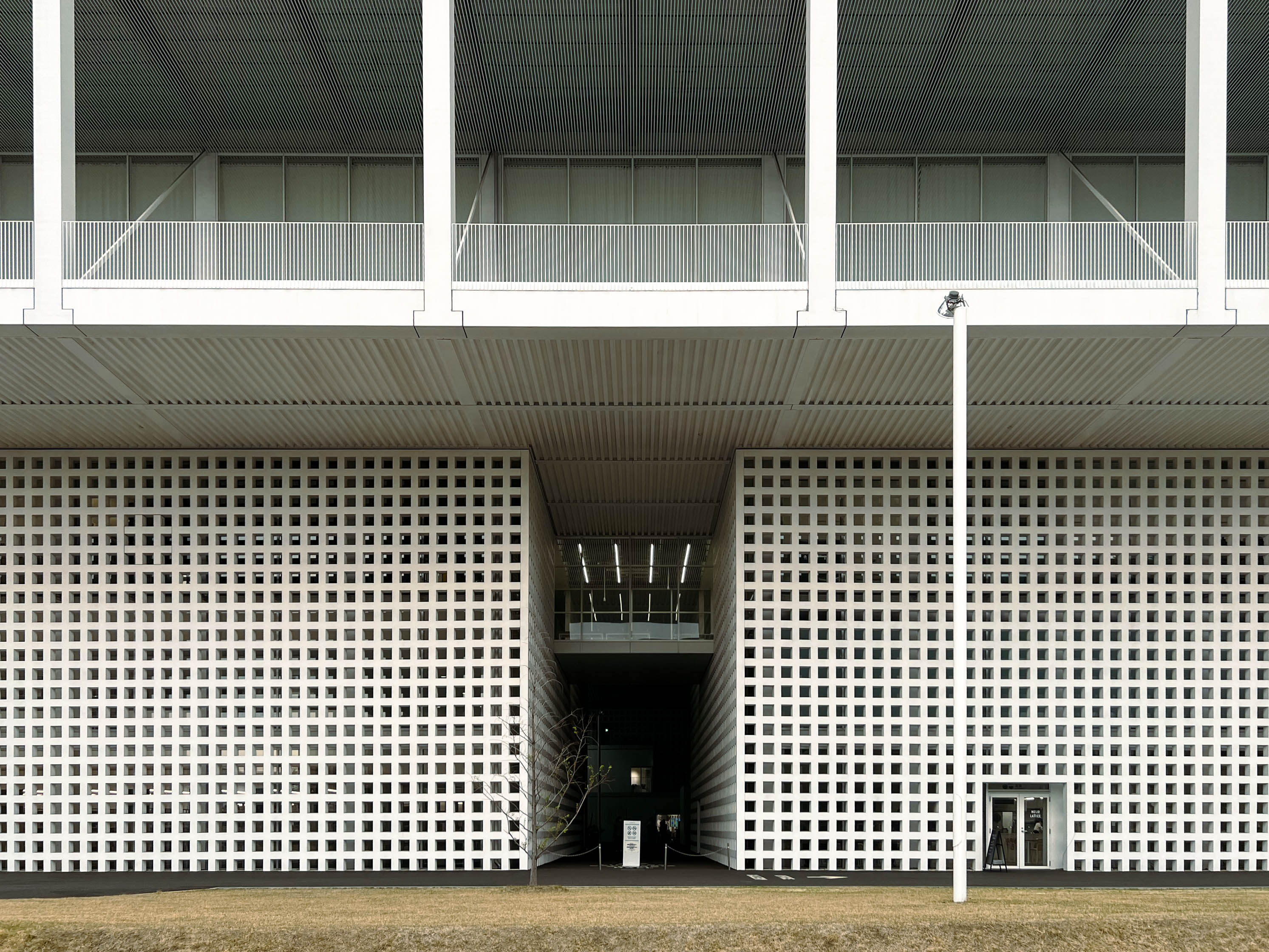
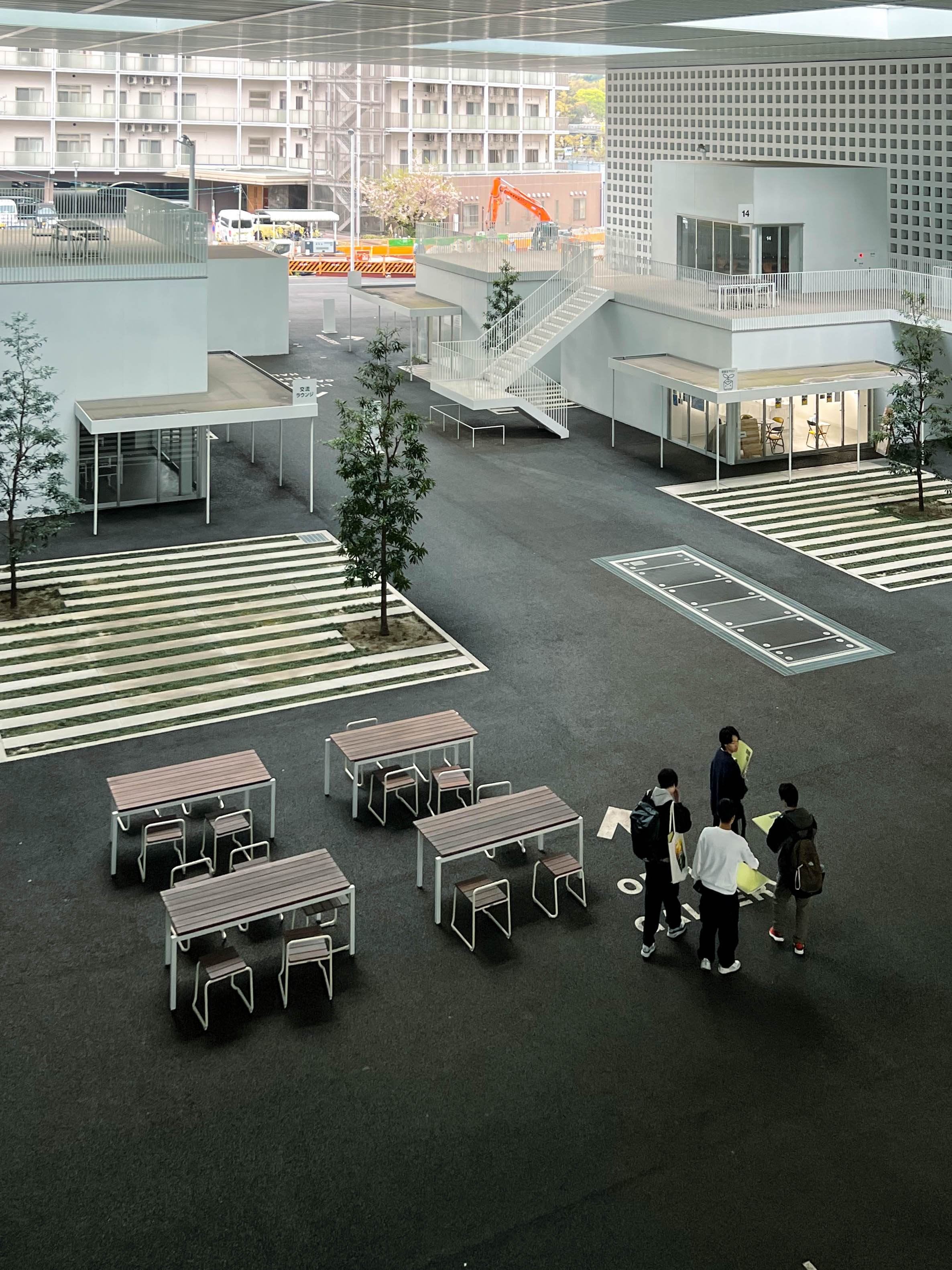
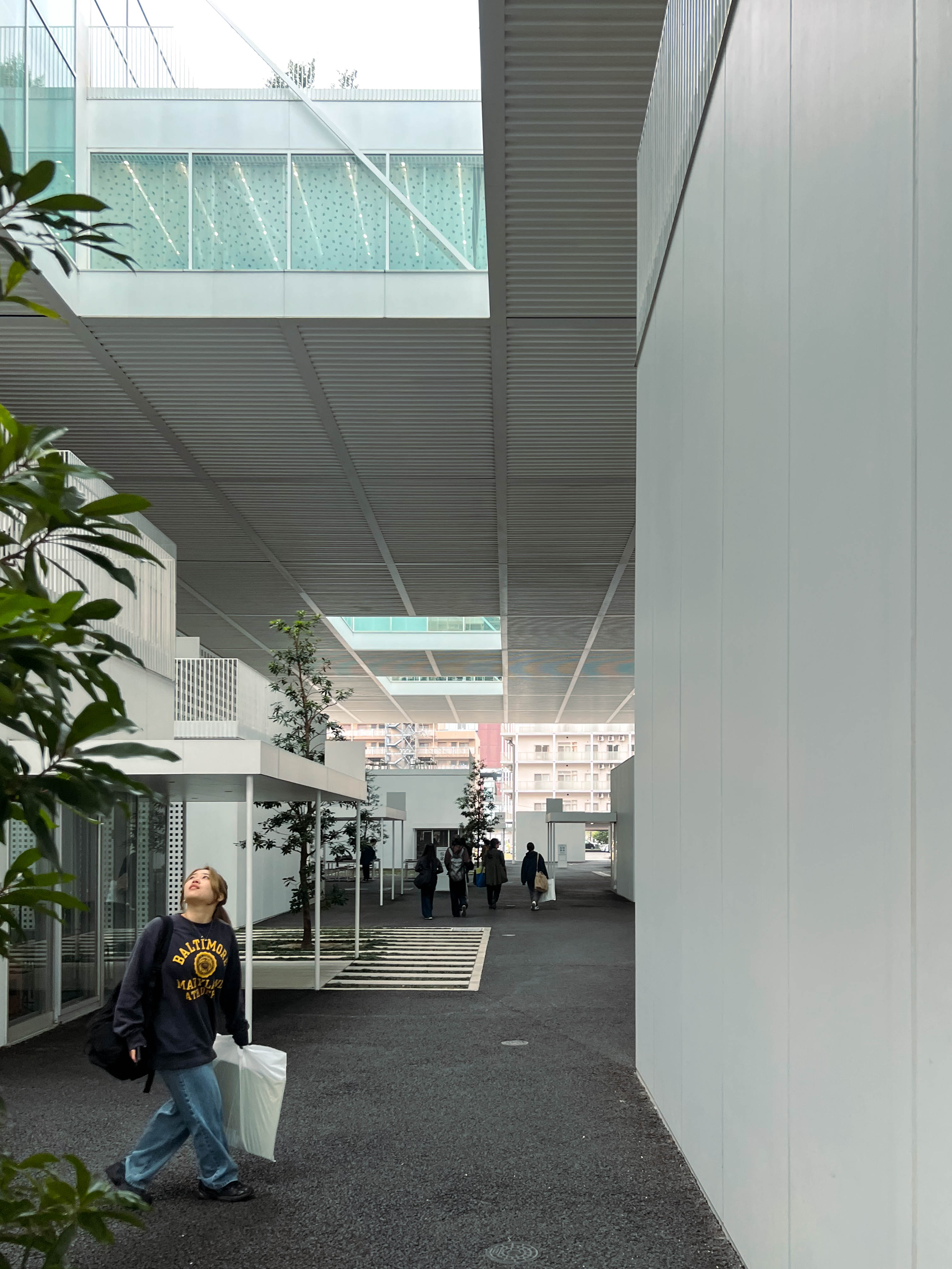
It begins at the “Art Street” located in between the building cores. The seemingly uniform cores give way to openings that take you to what is essentially a covered asphalt plaza. From the north and south sides, these entrances are much wider due to the axis taken up by the subway below. Scattered around Art Street are thirteen detached buildings, once again taking up cube-like forms, forming a miniature village underneath the roof structure. These house gallery spaces, classrooms, art supply shops, and offices. Exhaust vents for the station occasionally bleed the sound of trains and foot traffic from below.
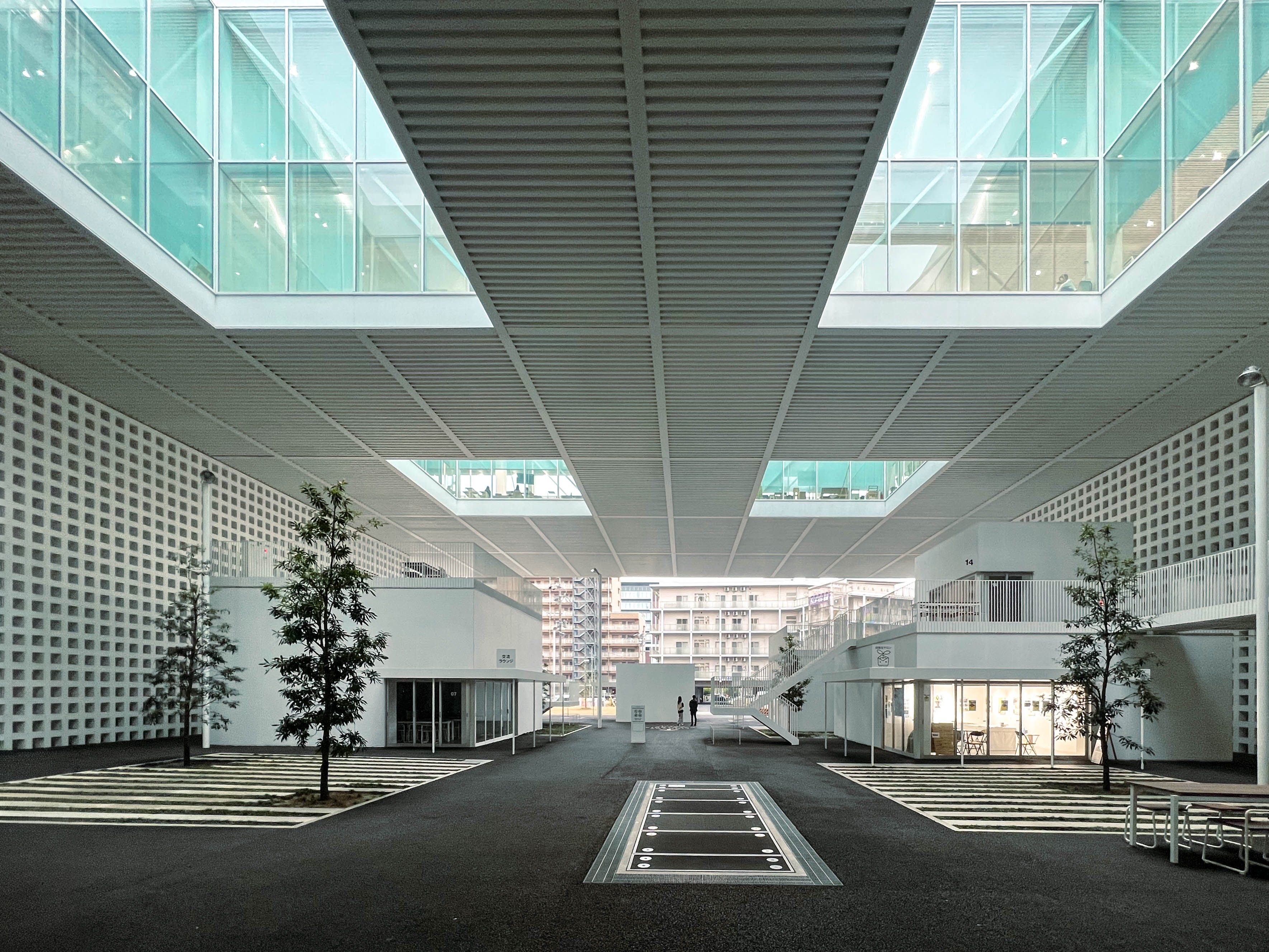
From above, eight skylights pierce through the ceiling into square courtyards that break up the gray asphalt pavement. Although I visited during a particularly overcast day, these skylights let in enough light into the open space below. Some of it is direct, while some is filtered and reflected off the aqua tinted glass above. The result is a dance between light and shadow – white materials allowed scarce light to bounce off its surface, while the asphalt street absorbed the rest. The atmosphere had a blue-ish tint to it.
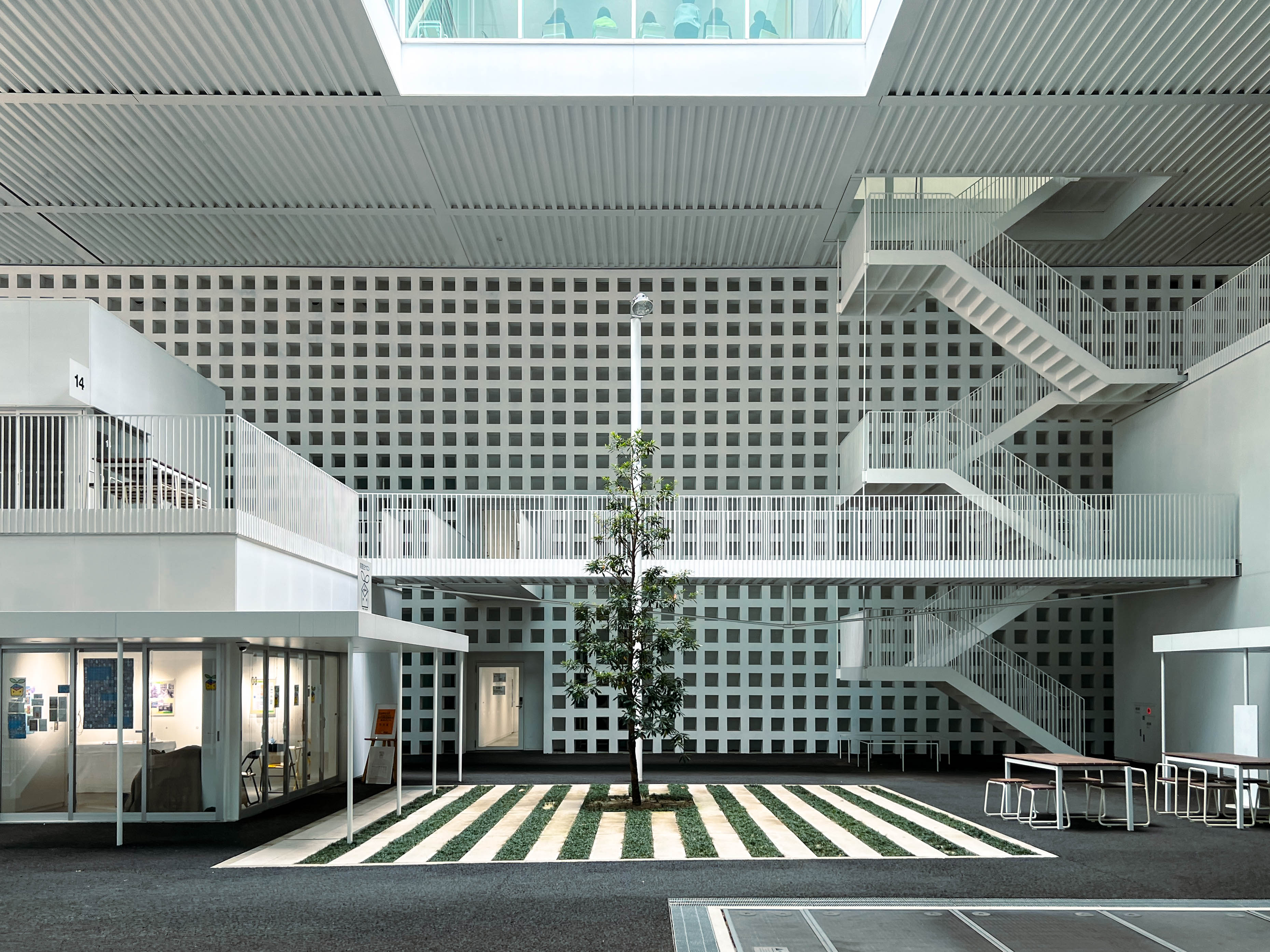
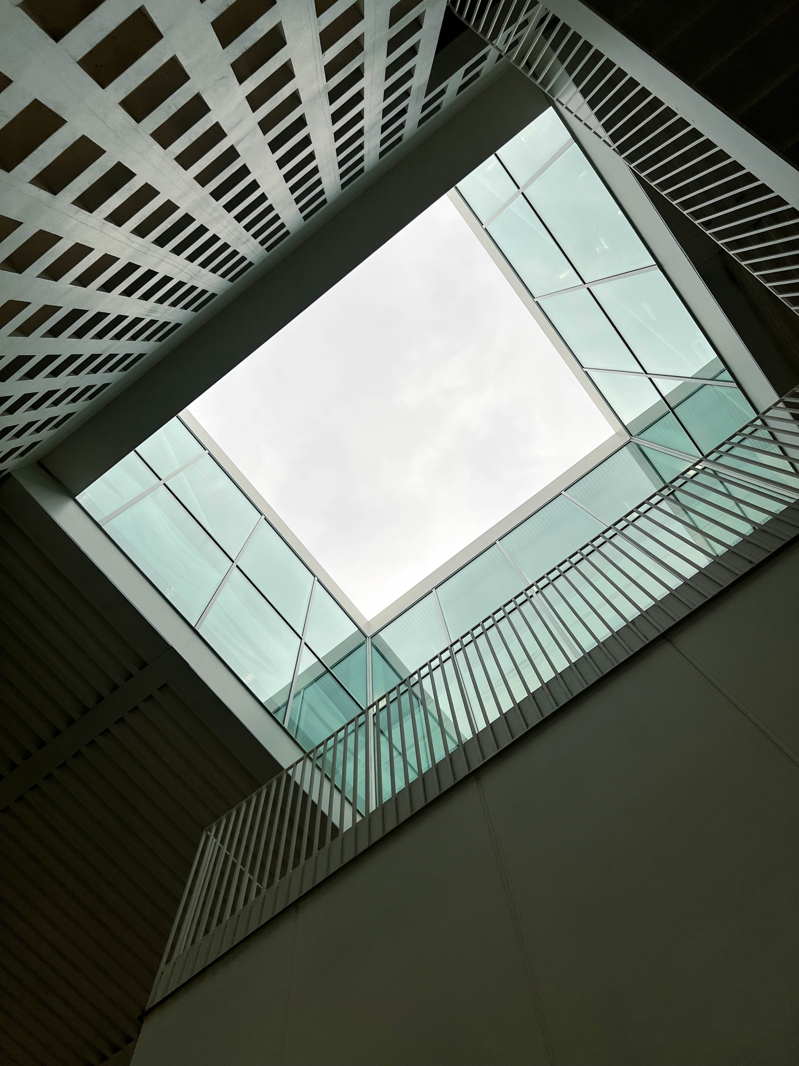
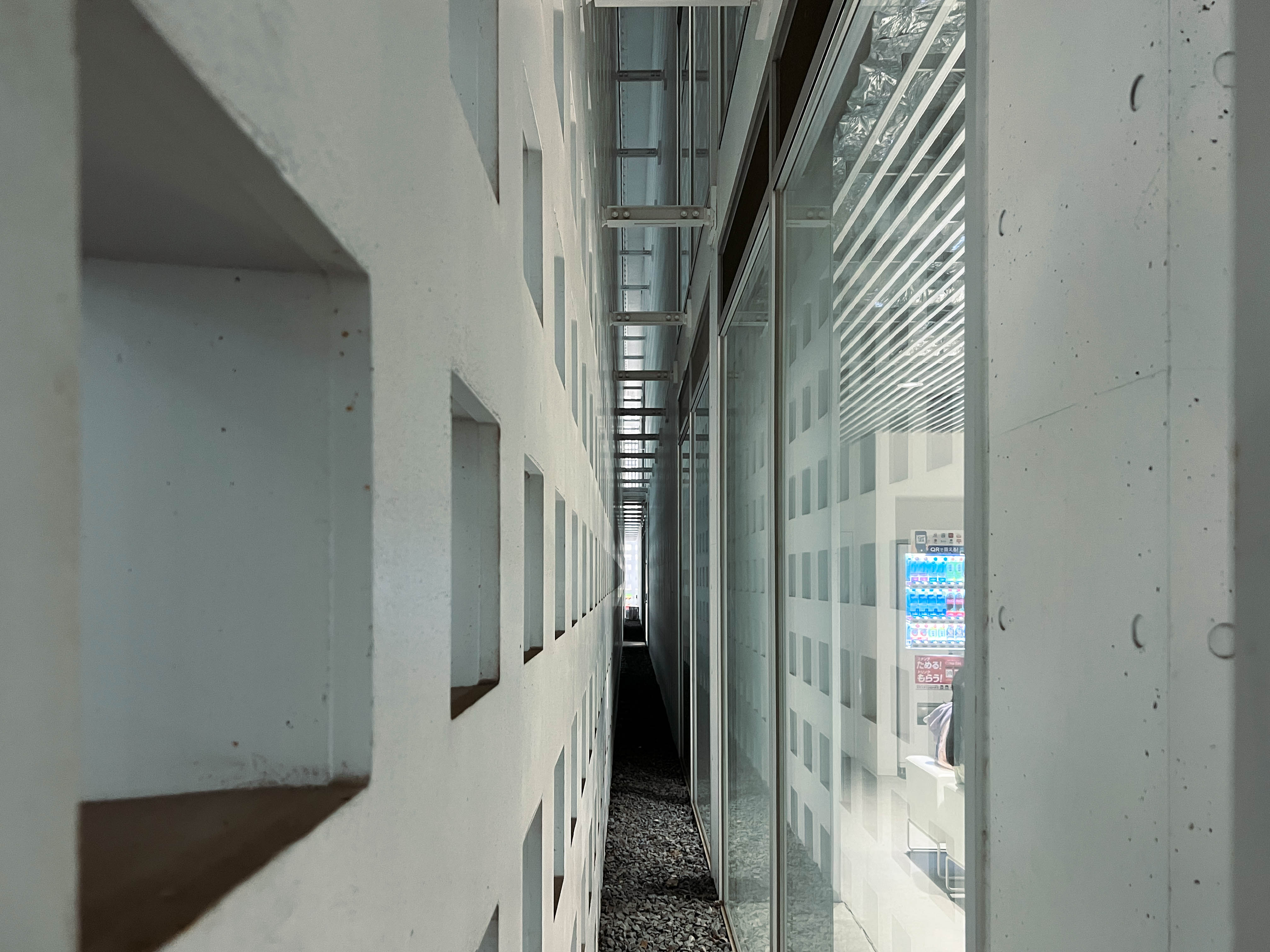
After wandering around the publicly accessible areas of the university, I found myself stumbling upon a couple of liminal spaces. Firstly were the areas in between interior and exterior. In the same way it does outside, the brise soleil wraps around the four cores from the view of the Art Street, allowing for a balance of openness and privacy. It was opaque enough to act as a wall to the interior, while still allowing a glimpse into the interior upon closer inspection. A space existed between the all white lower facade and the actual building structure behind it. There were also a couple of spaces not entirely indoors, where the facade wraps around and filters light resulting in what I can only describe as an aura from the glow of light that emanated from outside.
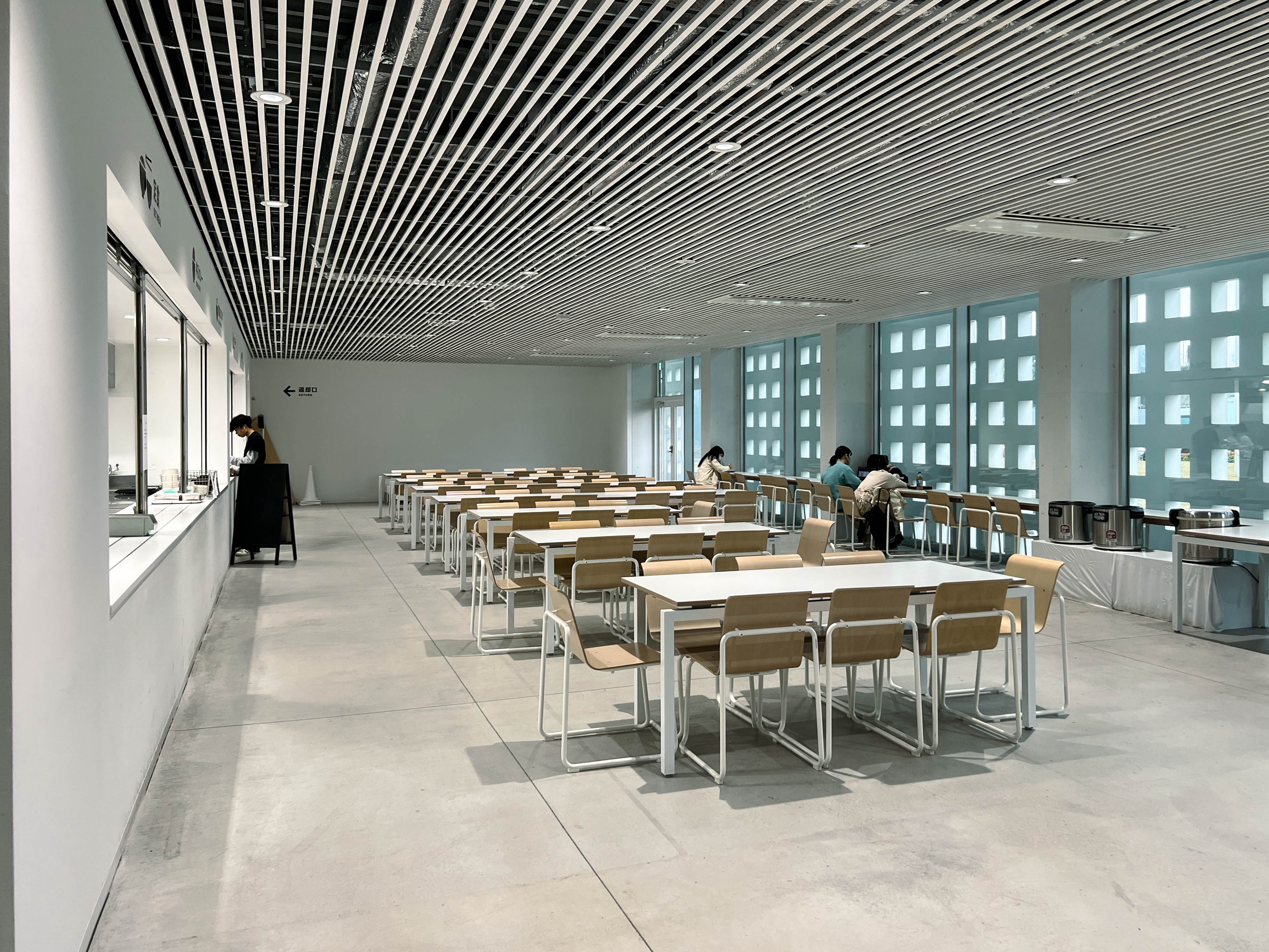
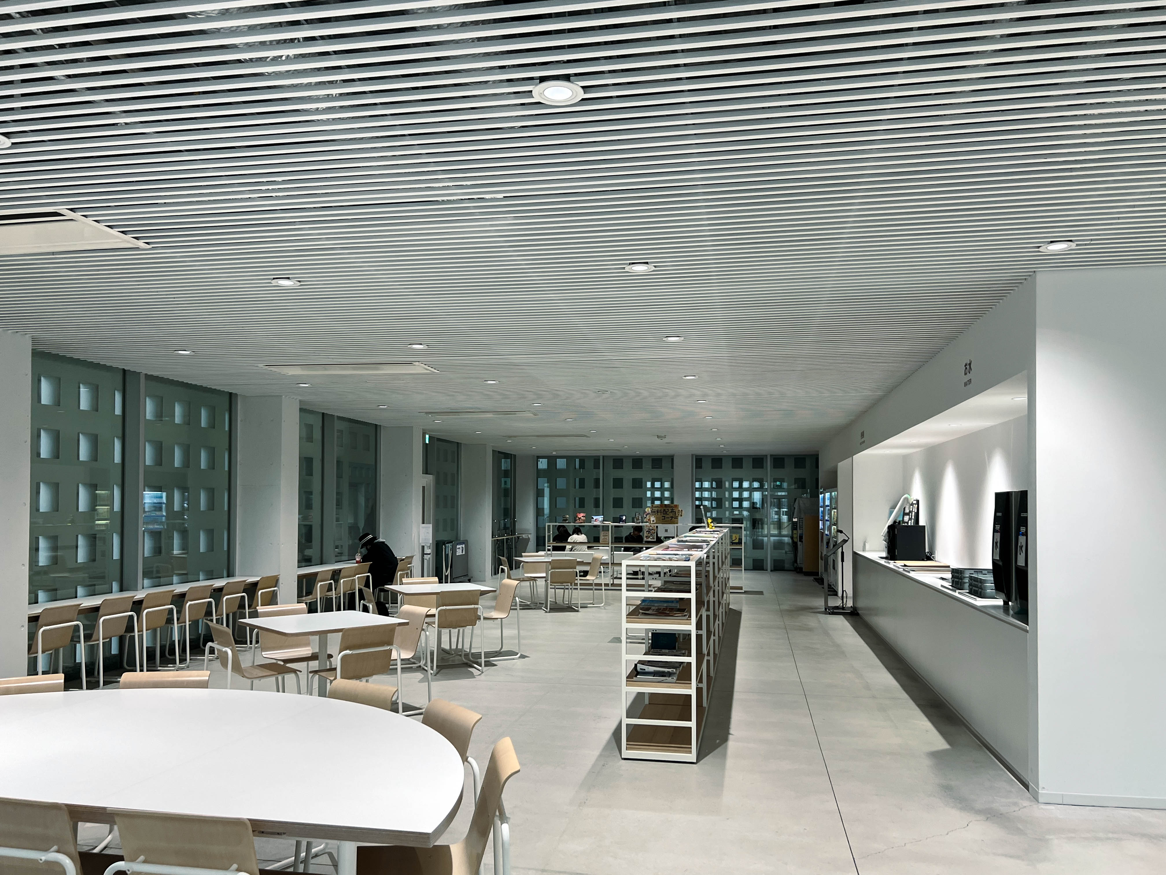
Secondly were the interior spaces that I did have access to. The welcome office (which politely told me which areas I could access), the art gallery, and the cafeteria. These places felt a bit sterile to me, partially due to the abundance of white in a more enclosed space, but also because of the difference in lighting compared to the Art Street you enter from. It’s almost blindingly bright inside. You can further tell the difference when facing the Art Street from inside, as it appears pretty dark in comparison.
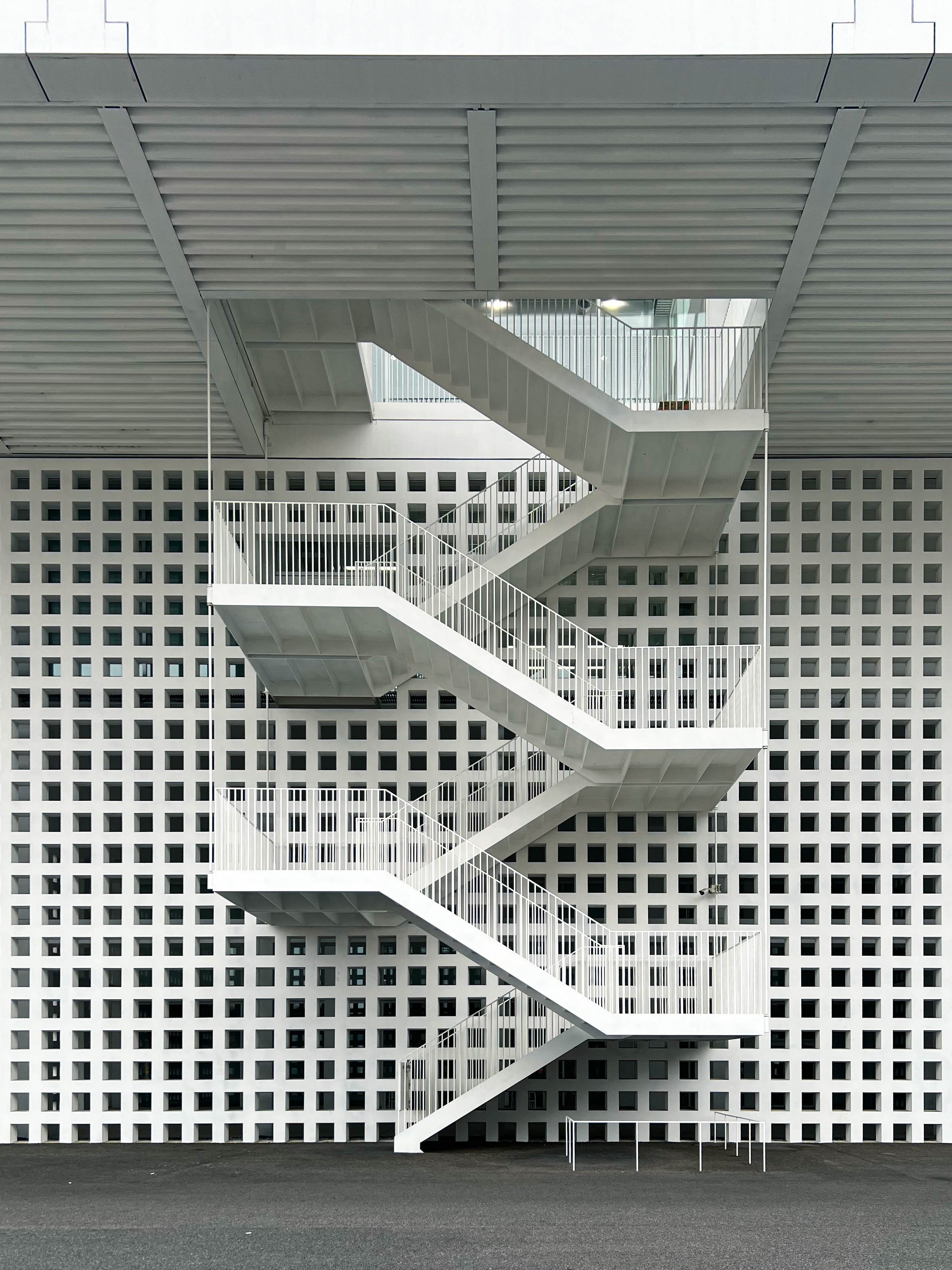
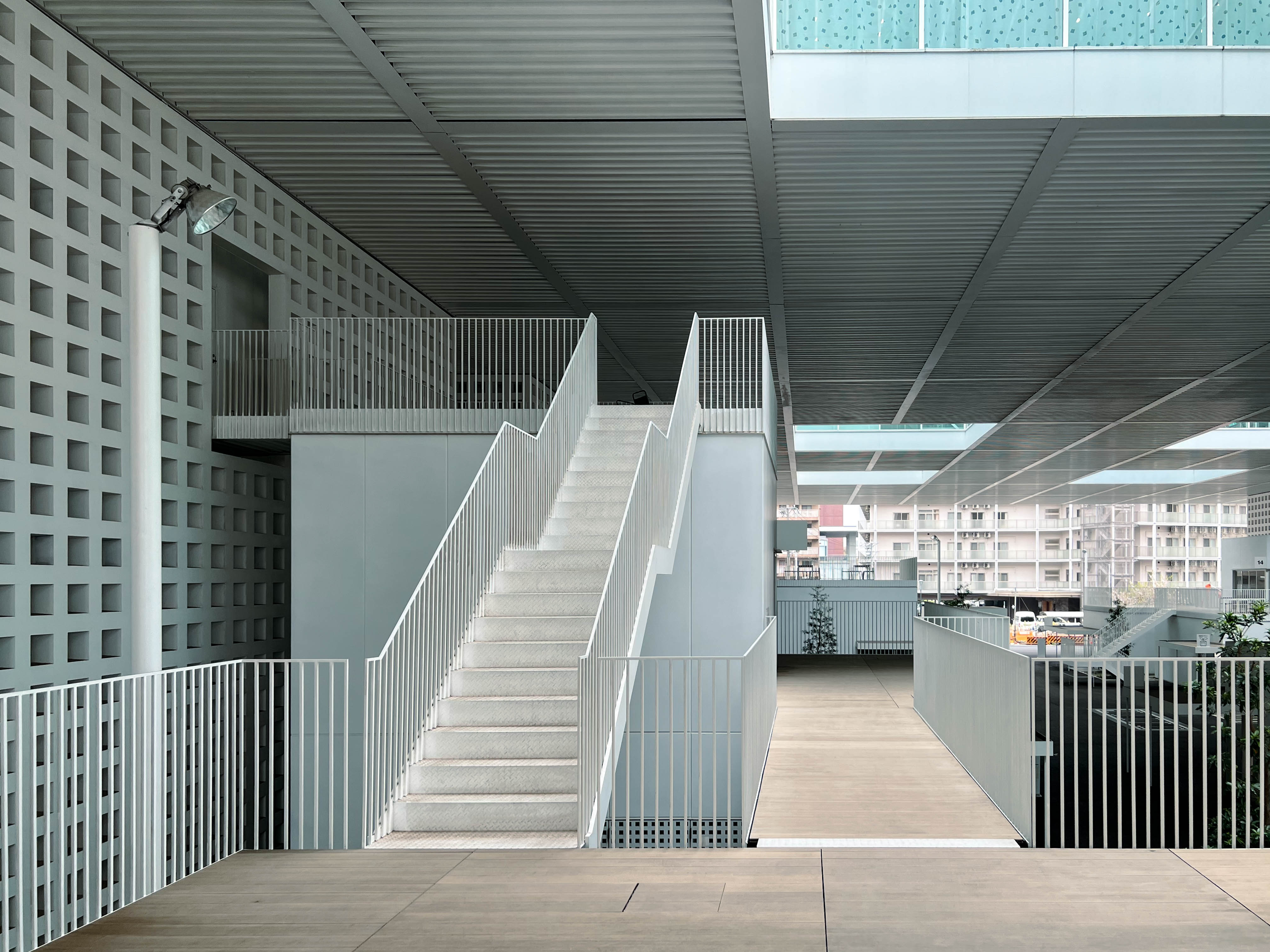
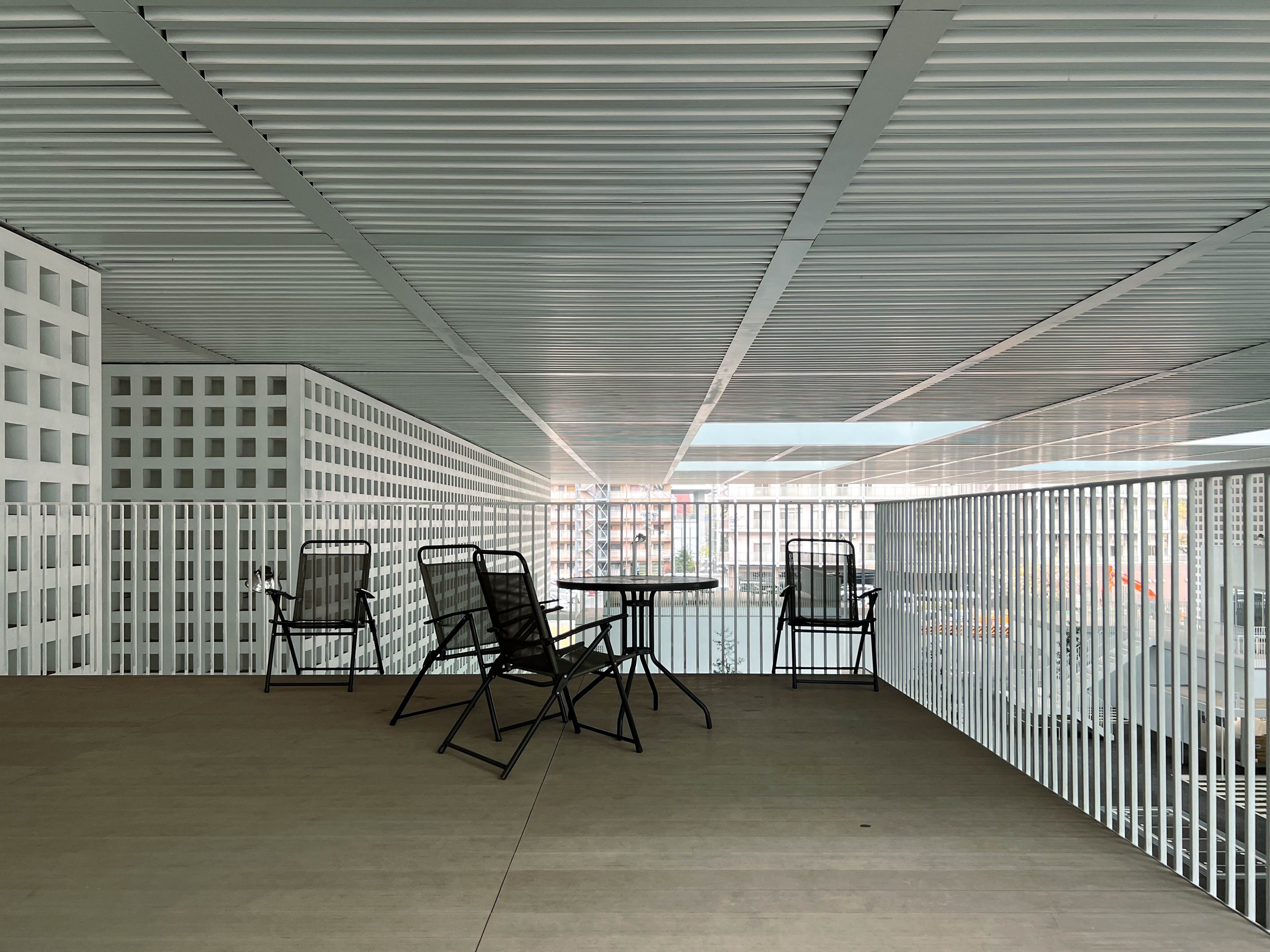
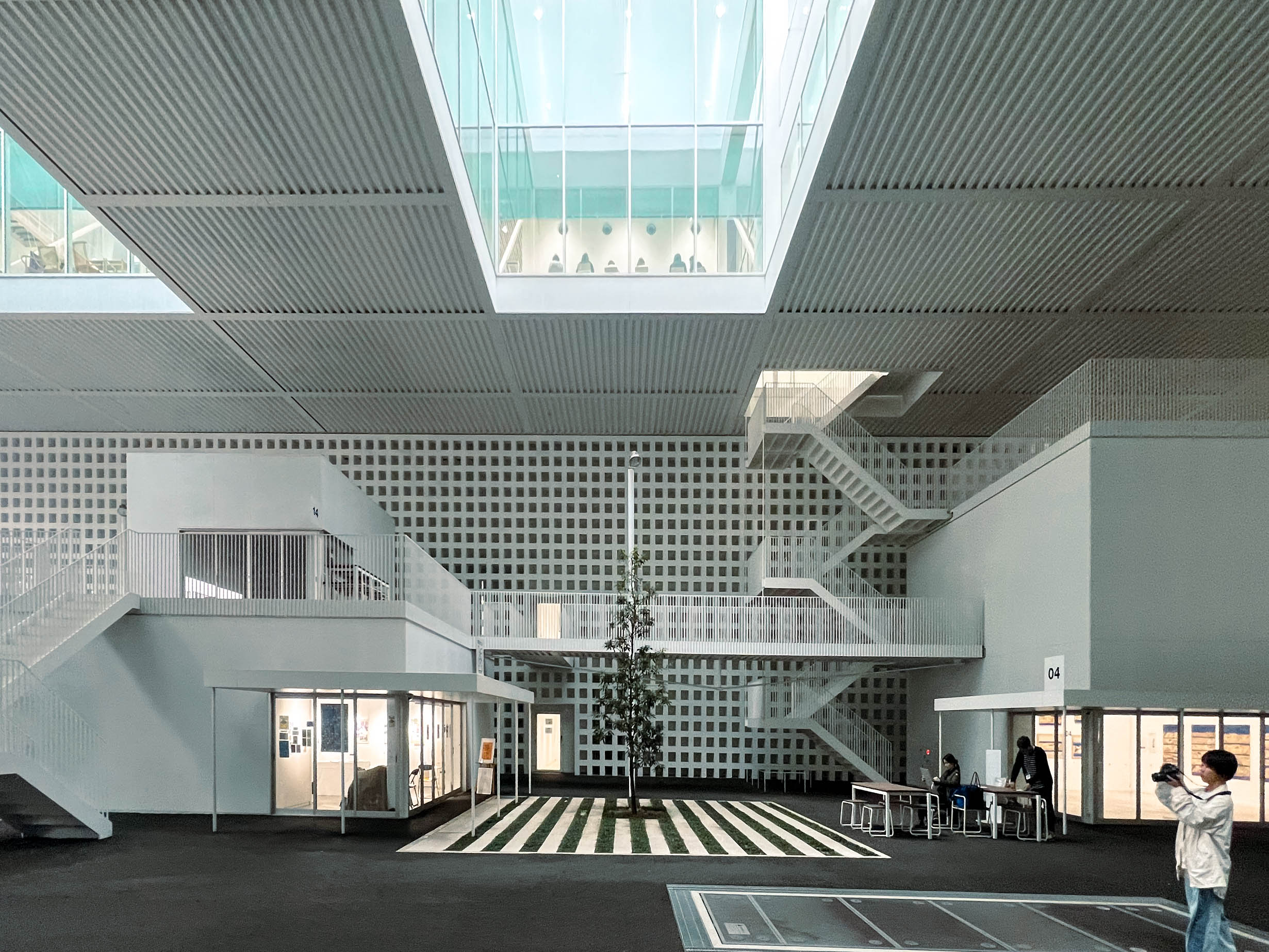
Lastly, between both the detached structures around the plaza and the campus building itself were a series of staircases and bridges connecting these forms. They were not closed off and assumed accessible to the public, so I found myself exploring more of the campus from this new angle above the ground. I ended up in spaces above the smaller buildings on the Art Street, not fully indoors, but somewhat private. Some chairs and tables were placed, but were arranged as if left unused for a long time. These were the spaces to me that truly felt liminal. Why were they so empty, and are there any people that actually come up here?
Either by sheer luck or a demonstration from the architecture itself, I watched from above as the period ended, and students began exiting from the building all from different places. From the library core and classrooms below, to behind me from one of the doors leading from upstairs. I wondered to myself if I was intruding on their space, as I had never felt more seen or out of place. Maybe, it was what Yamamoto had intended.
After continuing to sit in awkward silence while students poured out behind me, I made my way back to the Art Street and witnessed the campus spring to life. It was here where I began to observe how people use the programmed space. Students used the bridges and stairs outside to go from classroom to classroom. Others were gathered around the plaza, some drawing, some eating lunch, some talking with friends. Some students were looking to the skylights at awe, similar to how I was, and some were setting up outdoor games and activities. I also wandered around the buildings on Art Street and ended up in one of the galleries displaying student work, drawn by the glass unobstructed from a brise soleil facade. Inside I had a lovely conversation with one of the teachers attending to the space. With broken elementary Japanese and Google Translate in hand, I was able to tell her I was visiting the campus to view Riken Yamamoto’s building. She affectionately told me that the arena across the street was designed by [[Kengo Kuma]]. It was a conversation facilitated by the architecture of the detatched buildings, and the architect that designed them.
Back outside, particular group of students caught my attention. With DSLR’s in hand, they were roaming around the campus taking photos. I think it was for a class, but I believe that their curiosity wouldn’t be possible without the campus that serves as the assignment to photograph.
Herein lies the realization I made as to why I think Nagoya Zokei University works. It is a building that intrigues, and therefore a building that can spark creativity. You do not need to love this building in order to respond to it. It is normal enough on first glance to be unassuming, boring even. Yet, after time, becomes unique enough to illicit questions about aesthetics and physical space. Its design is intentional enough to warrant a response.
What I experienced was the architecture’s public facing side. The outsider’s perspective. There is a whole other world to experience as a student or faculty member. But that is an experience not afforded to me, and that I may never know. It was probably what Riken Yamamoto intended.
A campus I do have experience with as an insider is my own alma mater, Rafael Viñoly’s NYU Abu Dhabi. You can read my perspective about that here (coming soon).